数据分析之绘图可视化
matplotlib是一个用于创建出版质量图表的桌面绘图包,
- 不仅支持各种操作系统上许多不同的GUI后端,
- 而且能将图片导出为各种常见的矢量图或光栅图:PDF,SVG,JPG,PNG,BMP,GIF等。
可以导入配置文件查看可用后端,不同的操作系统可用后端会有所差异。
1
2
import matplotlib.rcsetup as rcsetup
print(rcsetup.all_backends)
常见的后端有:
| Backend | Description |
|---|---|
| Qt5Agg | Agg rendering in a Qt5 canvas (requires PyQt5). This backend can be activated in IPython with %matplotlib qt5. |
| pympl | Agg rendering embedded in a Jupyter widget. (requires ipympl). This backend can be enabled in a Jupyter notebook with %matplotlib ipympl. |
| GTK3Agg | Agg rendering to a GTK 3.x canvas (requires PyGObject, and pycairo or cairocffi). This backend can be activated in IPython with %matplotlib gtk3. |
| macosx | Agg rendering into a Cocoa canvas in OSX. This backend can be activated in IPython with %matplotlib osx. |
| TkAgg | Agg rendering to a Tk canvas (requires TkInter). This backend can be activated in IPython with %matplotlib tk. |
| nbAgg | Embed an interactive figure in a Jupyter classic notebook. This backend can be enabled in Jupyter notebooks via %matplotlib notebook. |
| WebAgg | On show() will start a tornado server with an interactive figure. |
| GTK3Cairo | Cairo rendering to a GTK 3.x canvas (requires PyGObject, and pycairo or cairocffi). |
| Qt4Agg | Agg rendering to a Qt4 canvas (requires PyQt4 or pyside). This backend can be activated in IPython with %matplotlib qt4. |
| WXAgg | Agg rendering to a wxWidgets canvas (requires wxPython 4). This backend can be activated in IPython with %matplotlib wx. |
可以修改配置文件matplotlibrc更改后端,也可以使用命令临时更改为指定的后端。
1 | import matplotlib |
- 魔法命令
%matplotlib notebook提供了在Notebook中交互绘图,强烈推荐使用此后端。 - 交互式绘图可以实时查看绘图效果,在非交互式绘图下需要通过
plt.show()显示figure。 - 需要注意的是必须在导入绘图包之前修改,或者修改再重新导入。
1 | %matplotlib notebook |
matplotlib绘图绘图会用到numpy,scipy等包,可以在开始一并导入。
1 | import numpy as np |
matplotlib API入门
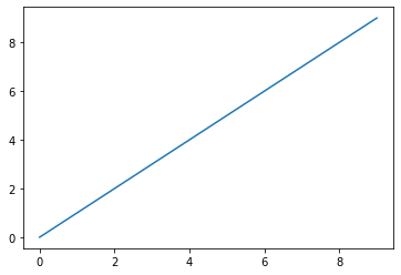
1 | data = np.arange(10) |
array([0, 1, 2, 3, 4, 5, 6, 7, 8, 9])

[<matplotlib.lines.Line2D at 0x1f857201af0>]
基本概念
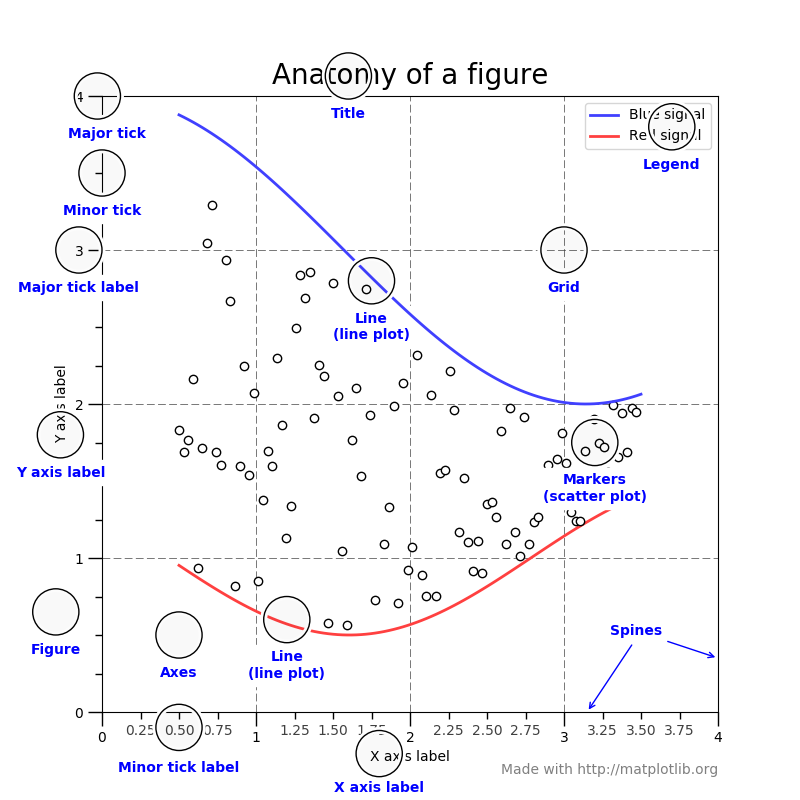
Figure:The whole figure.
- The figure keeps track of all the child Axes, (可以有几个,但至少应有一个)
- a smattering of 'special' artists (titles, figure legends, etc),
- and the canvas.
创建figure的方法:
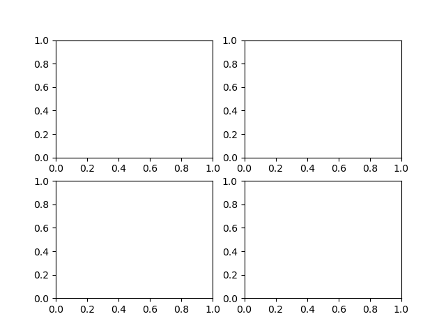
1 | fig = plt.figure() # an empty figure with no axes |

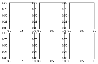
1 | fig, ax_lst = plt.subplots(2, 2) # a figure with a 2x2 grid of Axes |
Axes
- it is the region of the image with the data space.
- A given figure can contain many Axes, but a given Axes object can only be in one Figure
- The Axes contains two (or three in the case of 3D) Axis objects
Artist
- Basically everything you can see on the figure is an artist (even the Figure, Axes, and Axis objects).
- This includes Text objects, Line2D objects, collection objects, Patch objects ... (you get the idea). When the figure is rendered, all of the artists are drawn to the canvas.
Figures 和Subplots
- matplotlib的图像都位于
Figure对象中,可以用plt.figure创建一个新的Figure. plt.figure有一些选项,特别是figsize用于确定图片的大小和纵横比。- Figure还支持编号构建,譬如通过
plt.figure(2)编号,后续可以通过plt.gcf()获取当前Figure的引用(Get the current figure.)。
1 | fig = plt.figure(figsize=(4,3)) |
[<matplotlib.lines.Line2D at 0x1f8572f0df0>,
 <matplotlib.lines.Line2D at 0x1f8572f0e20>,
 <matplotlib.lines.Line2D at 0x1f8572f0f40>]
numpy数组的每列数据作为一个系列
不能通过空Figure绘图,必须用
add_subplot创建一个或多个subplot才行:
1 | fig = plt.figure() |
1 | ax2 = fig.add_subplot(2, 2, 2) # 第二个 |
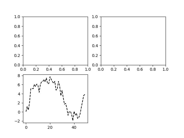
如果此时发出一条绘图命令,则matplotlib会在最后一个用过的subplot上绘图。如果没有,则会创建一个。
1 | plt.plot(np.random.randn(50).cumsum(), 'k--') |
[<matplotlib.lines.Line2D at 0x1f857407b50>]
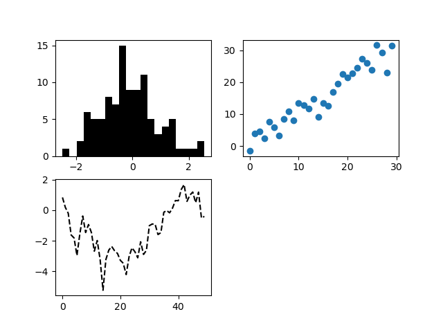
1 | _ = ax1.hist(np.random.randn(100), bins=20, color='k') |
<matplotlib.collections.PathCollection at 0x7ff6e0713670>
- 由于根据特定的布局创建Figure和subplot非常常见,所以有了更为简便的方法。
plt.subplots,其创建一个Figure,并返回一个含有已创建subplot对象的NumPy数组。
1 | fig = plt.figure() |
array([[<matplotlib.axes._subplots.AxesSubplot object at 0x000001F8574A3AF0>,
        <matplotlib.axes._subplots.AxesSubplot object at 0x000001F8574CDE80>,
        <matplotlib.axes._subplots.AxesSubplot object at 0x000001F8575072E0>],
       [<matplotlib.axes._subplots.AxesSubplot object at 0x000001F857531700>,
        <matplotlib.axes._subplots.AxesSubplot object at 0x000001F8573891C0>,
        <matplotlib.axes._subplots.AxesSubplot object at 0x000001F8574E2700>]],
      dtype=object)
pyplot.subplots选项
| 参数 | 说明 |
|---|---|
nrows |
行数 |
ncols |
列数 |
sharex |
共用X轴刻度 |
sharey |
共用Y轴刻度 |
subplot_kw |
用于创建subpolot的各关键字字典 |
**fig_kw |
创建figure时的其他关键字,如plt.subplots(2,2, figsize=(8,6)) |
调整subplots周围间距
- 默认情况下,subplot周围会会留下一定的边距,并在subplot之间留下一定的间距。间距跟图像的高度和宽度有关。
- 利用Figure的
subplots_adjust方法可以修改,同时也是一个顶级函数。
subplots_adjust(left=None, bottom=None, right=None, top=None,wspace=None, hspace=None)
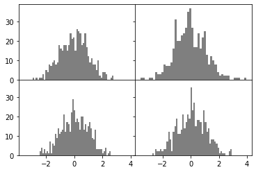
1 | fig, axes = plt.subplots(2, 2, sharex=True, sharey=True) |
(array([ 1.,  0.,  1.,  0.,  1.,  1.,  3.,  0.,  5.,  4.,  8.,  7.,  9.,
        10.,  8.,  9., 18., 16., 15., 18., 18., 15., 18., 24., 21., 22.,
        15., 26., 25., 24., 18., 19., 24., 17., 12.,  9., 11.,  8.,  8.,
         5., 10.,  2.,  1.,  4.,  4.,  3.,  0.,  0.,  1.,  2.]),
 array([-2.9647459 , -2.84955375, -2.7343616 , -2.61916946, -2.50397731,
        -2.38878516, -2.27359301, -2.15840087, -2.04320872, -1.92801657,
        -1.81282443, -1.69763228, -1.58244013, -1.46724799, -1.35205584,
        -1.23686369, -1.12167155, -1.0064794 , -0.89128725, -0.7760951 ,
        -0.66090296, -0.54571081, -0.43051866, -0.31532652, -0.20013437,
        -0.08494222,  0.03024992,  0.14544207,  0.26063422,  0.37582636,
         0.49101851,  0.60621066,  0.72140281,  0.83659495,  0.9517871 ,
         1.06697925,  1.18217139,  1.29736354,  1.41255569,  1.52774783,
         1.64293998,  1.75813213,  1.87332427,  1.98851642,  2.10370857,
         2.21890072,  2.33409286,  2.44928501,  2.56447716,  2.6796693 ,
         2.79486145]),
 <a list of 50 Patch objects>)
(array([ 1.,  1.,  0.,  0.,  1.,  1.,  0.,  4.,  3.,  3.,  4.,  8.,  7.,
         7.,  9., 16., 31., 20., 20., 23., 24., 27., 35., 37., 27., 17.,
        17., 24., 16., 22., 25., 13.,  8., 12., 10.,  8.,  4.,  2.,  3.,
         2.,  2.,  2.,  0.,  0.,  1.,  1.,  1.,  0.,  0.,  1.]),
 array([-3.55851167, -3.40843362, -3.25835557, -3.10827751, -2.95819946,
        -2.80812141, -2.65804336, -2.5079653 , -2.35788725, -2.2078092 ,
        -2.05773114, -1.90765309, -1.75757504, -1.60749698, -1.45741893,
        -1.30734088, -1.15726282, -1.00718477, -0.85710672, -0.70702866,
        -0.55695061, -0.40687256, -0.2567945 , -0.10671645,  0.0433616 ,
         0.19343965,  0.34351771,  0.49359576,  0.64367381,  0.79375187,
         0.94382992,  1.09390797,  1.24398603,  1.39406408,  1.54414213,
         1.69422019,  1.84429824,  1.99437629,  2.14445435,  2.2945324 ,
         2.44461045,  2.59468851,  2.74476656,  2.89484461,  3.04492266,
         3.19500072,  3.34507877,  3.49515682,  3.64523488,  3.79531293,
         3.94539098]),
 <a list of 50 Patch objects>)
(array([ 2.,  4.,  1.,  3.,  1.,  2.,  1.,  7.,  1.,  6.,  5., 11.,  9.,
        14., 11., 12., 13., 21., 12., 17., 16., 12., 22., 29., 23., 17.,
        19., 17., 13., 20., 20., 13., 16., 12., 15., 17., 14.,  9.,  8.,
        13.,  3.,  3.,  3.,  3.,  1.,  2.,  4.,  0.,  1.,  2.]),
 array([-2.47205165, -2.37117853, -2.27030542, -2.1694323 , -2.06855919,
        -1.96768608, -1.86681296, -1.76593985, -1.66506673, -1.56419362,
        -1.46332051, -1.36244739, -1.26157428, -1.16070116, -1.05982805,
        -0.95895494, -0.85808182, -0.75720871, -0.65633559, -0.55546248,
        -0.45458937, -0.35371625, -0.25284314, -0.15197002, -0.05109691,
         0.0497762 ,  0.15064932,  0.25152243,  0.35239555,  0.45326866,
         0.55414177,  0.65501489,  0.755888  ,  0.85676112,  0.95763423,
         1.05850734,  1.15938046,  1.26025357,  1.36112669,  1.4619998 ,
         1.56287291,  1.66374603,  1.76461914,  1.86549226,  1.96636537,
         2.06723848,  2.1681116 ,  2.26898471,  2.36985783,  2.47073094,
         2.57160405]),
 <a list of 50 Patch objects>)
(array([ 1.,  0.,  3.,  2.,  2.,  3.,  2.,  3.,  3.,  7., 12.,  8.,  2.,
        12., 15., 19., 11., 11., 13., 21., 14., 17., 21., 19., 35., 23.,
        27., 15., 18., 18., 17., 11., 23., 17., 12., 14.,  6.,  8.,  8.,
         7.,  6.,  4.,  1.,  2.,  1.,  1.,  0.,  0.,  2.,  3.]),
 array([-2.73813947, -2.62509685, -2.51205423, -2.39901161, -2.28596899,
        -2.17292637, -2.05988375, -1.94684114, -1.83379852, -1.7207559 ,
        -1.60771328, -1.49467066, -1.38162804, -1.26858542, -1.1555428 ,
        -1.04250018, -0.92945757, -0.81641495, -0.70337233, -0.59032971,
        -0.47728709, -0.36424447, -0.25120185, -0.13815923, -0.02511662,
         0.087926  ,  0.20096862,  0.31401124,  0.42705386,  0.54009648,
         0.6531391 ,  0.76618172,  0.87922434,  0.99226695,  1.10530957,
         1.21835219,  1.33139481,  1.44443743,  1.55748005,  1.67052267,
         1.78356529,  1.8966079 ,  2.00965052,  2.12269314,  2.23573576,
         2.34877838,  2.461821  ,  2.57486362,  2.68790624,  2.80094885,
         2.91399147]),
 <a list of 50 Patch objects>)
颜色、标记和线型(Colors, Markers, and Line Styles)
ax.plot(x, y, 'g--')
ax.plot(x, y, linestyle='--', color='g')
- 常用颜色:r:Red; y:yelow, b:blue, g:green, c:cyan, k:black, w:white。也可以使用RGB形式使用,譬如:'#CECECE'
- 常用线性:':':dotted、‘--’:dashed、‘-.’:dashdotted,'-':solid
- 线型图还可以加上一些标记(marker),以强调实际的数据点。常用marker: '.' ',' 'o' 'v'等,具体参考列表
1 | plt.figure() |
[<matplotlib.lines.Line2D at 0x1f8578ffd00>]
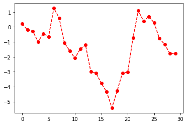
上述命令等价于: 1
plt.plot(np.random.randn(30).cumsum(), color='r', linestyle='dashed', marker='o')
1 | plt.close('all') # close all the figure window |
- 连线时采用插值法(点与点之间插值)
1 | data = np.random.randn(30).cumsum() |
[<matplotlib.lines.Line2D at 0x1f85893f700>]


[<matplotlib.lines.Line2D at 0x1f85893fb50>]


<matplotlib.legend.Legend at 0x1f85893f550>
刻度、标签和图例(Ticks, Labels, and Legends)
xlim,xticks,xticklabels之类的方法可以控制图表的范围、刻度位置、刻度标签- 如果调用时不带参数,则返回当前的参数值,譬如
plt.xlim()返回当前x轴的绘图范围 - 调用时带参数,则设置参数值。譬如,
plt.xlim([0, 10])将X轴的范围设置为0到10。
设置标题、轴标签、刻度以及刻度标签
1 | fig = plt.figure() |
[<matplotlib.lines.Line2D at 0x1f8589ae3a0>]
1 | ticks = ax.set_xticks([0, 250, 500, 750, 1000]) |
1 | ax.set_title('My first matplotlib plot') |
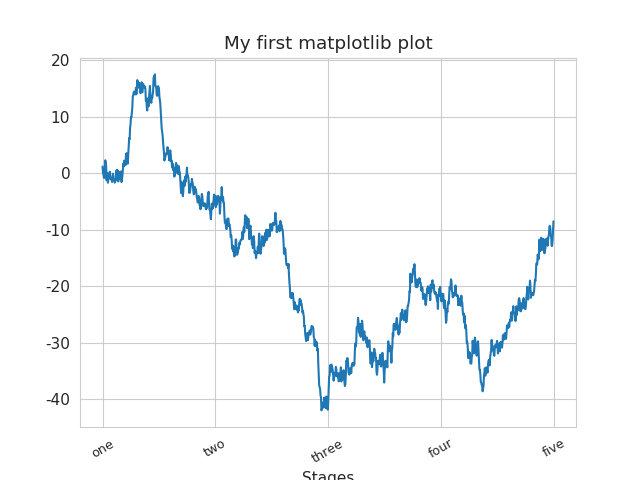
Text(0.5, 1.0, 'My first matplotlib plot')


Text(0.5, 3.1999999999999993, 'Stages')
也可以通过下述方式进行设置:
props = { 'title': 'My first matplotlib plot', 'xlabel': 'Stages' } ax.set(**props)
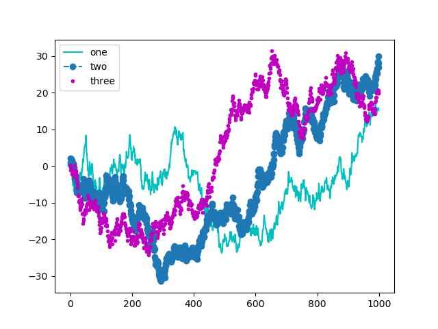
添加图例
- 可以在添加subplot时传入label参数
- 也可以调用
ax.legend()或plt.legend()创建图例。
1 | fig = plt.figure(); |
[<matplotlib.lines.Line2D at 0x1f857884ac0>]


[<matplotlib.lines.Line2D at 0x1f8576a1ee0>]


[<matplotlib.lines.Line2D at 0x1f8576b0dc0>]
1 | ax.legend(loc='best') # 自动选址图例最佳位置 |
<matplotlib.legend.Legend at 0x1f8578cbdc0>
注解以及subplot上绘图
- 如需绘制一些自定义的注解(譬如,文本、箭头或其他图形),可以通过
text、arrow和annotate等函数进行添加。
1 | ax.text(x, y, 'Hello world!', |
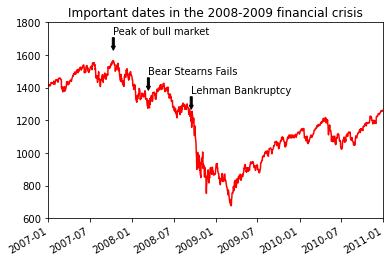
1 | import datetime |
| SPX | |
|---|---|
| 1990-02-01 | 328.79 |
| 1990-02-02 | 330.92 |
| 1990-02-05 | 331.85 |
| 1990-02-06 | 329.66 |
| 1990-02-07 | 333.75 |
<matplotlib.axes._subplots.AxesSubplot at 0x1f8576951c0>
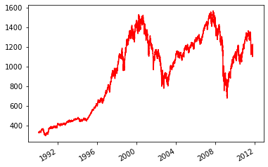
1 | import datetime |
<matplotlib.axes._subplots.AxesSubplot at 0x1f858b30dc0>


Text(2007-10-11 00:00:00, 1779.41, 'Peak of bull market')


Text(2008-03-12 00:00:00, 1533.77, 'Bear Stearns Fails')


Text(2008-09-15 00:00:00, 1417.7, 'Lehman Bankruptcy')


(732677.0, 734138.0)


(600.0, 1800.0)


Text(0.5, 1.0, 'Important dates in the 2008-2009 financial crisis')
绘制图形
- matplotlib有一些表示常见图形的对象,这些对象成为块(patch)
。要在图表中加入一个图形,需要创建一个块对象
shp,然后通过ax.add_patch(shp)将其添加到subplot中。
1 | fig = plt.figure(figsize=(12, 6)) |
<matplotlib.patches.Rectangle at 0x1f858b75e20>


<matplotlib.patches.Circle at 0x1f858bc30d0>


<matplotlib.patches.Polygon at 0x1f858b75c70>

将图表保存到文件
利用plt.savefig保存到文件。
1 | plt.savefig('figpath.svg') |
1 | plt.savefig('figpath.png', dpi=400, bbox_inches='tight') |
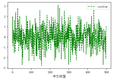
matplotlib配置
1 | plt.rc('figure', figsize=(10, 10)) |
1 | font_options = {'family' : 'monospace', |
绘图中的标注包含中文时必须使用支持中文的字体
1 | font_options = {'family':'SimSun','size':11} |
[<matplotlib.lines.Line2D at 0x1f858d9a880>]


<matplotlib.legend.Legend at 0x1f8578d4130>


Text(0.5, 0, '中文标签')
Plotting with pandas
Pandas基于matplotlib开发了绘图功能。
线型图
Series和DataFrame都有一个专门用于生产各类图表的plot方法,默认情况下其生成的是线型图。
1 | s = pd.Series(np.random.randn(10).cumsum(), index=np.arange(0, 100, 10)) |
<matplotlib.axes._subplots.AxesSubplot at 0x1f858cfd310>
- Series对象的索引会被传给matlibplot,并用以绘制X轴。可以用
use_index=False禁用此功能。 - x轴的刻度和界限可以通过xticks和xlim选项进行调节,y轴就用yticks和ylim进行调整。
Series.plot方法的参数:
| 参数 | 说明 |
|---|---|
label |
图例标签 |
ax |
在其上进行绘制的matlibplot subplot对象。如果没有设置,则使用当前matlibplot subplot |
style |
要传递给matlibplot的风格字符串,例如 ko- |
alpha |
图表填充的不透明度 |
kind |
可以是line,bar,
barh,kde |
logy |
在y轴上使用对数标尺 |
use_index |
经对象的索引用作刻度标签 |
rot |
旋转刻度标签(0---360) |
xticks |
用作x轴刻度的值 |
yticks |
用作y轴刻度的值 |
xlim |
x轴的界限 |
ylim |
y轴的界限 |
grid |
显示轴网格线,默认打开 |
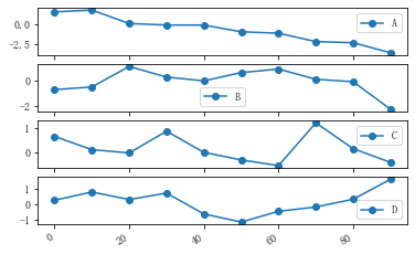
1 | df = pd.DataFrame(np.random.randn(10, 4).cumsum(0), |
array([<matplotlib.axes._subplots.AxesSubplot object at 0x000001F858D02B80>,
       <matplotlib.axes._subplots.AxesSubplot object at 0x000001F85919BCD0>,
       <matplotlib.axes._subplots.AxesSubplot object at 0x000001F8591BCF10>,
       <matplotlib.axes._subplots.AxesSubplot object at 0x000001F8591F60D0>],
      dtype=object)
DataFrame的plot的参数
| 参数 | 说明 |
|---|---|
subplots |
将各个DataFrame列绘制到单独的subplot中 |
sharex |
是否共用一个X轴,包括刻度和界限 |
sharey |
是否共用一个Y轴,包括刻度和界限 |
figsize |
表示图像大小的元组 |
title |
图像标题 |
legend |
添加一个subplot图例,默认为True |
sort_columns |
以字母表顺序绘制各列,默认使用当前列顺序 |
柱状图(Bar Plots)
1 | fig, axes = plt.subplots(2, 1) |
<matplotlib.axes._subplots.AxesSubplot at 0x1f859289f70>


<matplotlib.axes._subplots.AxesSubplot at 0x1f8592cfbb0>


<matplotlib.axes._subplots.AxesSubplot at 0x1f859289f70>
对于DataFrame,柱状图会将每一行的值分为一组
1 | np.random.seed(12348) |
1 | df = pd.DataFrame(np.random.rand(6, 4), |
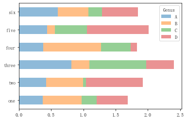
| Genus | A | B | C | D |
|---|---|---|---|---|
| one | 0.370670 | 0.602792 | 0.229159 | 0.486744 |
| two | 0.420082 | 0.571653 | 0.049024 | 0.880592 |
| three | 0.814568 | 0.277160 | 0.880316 | 0.431326 |
| four | 0.374020 | 0.899420 | 0.460304 | 0.100843 |
| five | 0.433270 | 0.125107 | 0.494675 | 0.961825 |
| six | 0.601648 | 0.478576 | 0.205690 | 0.560547 |
<matplotlib.axes._subplots.AxesSubplot at 0x1f859361820>


<matplotlib.axes._subplots.AxesSubplot at 0x1f85916c760>
- 索引的标题Genus用作图例的标题
- 设置stacked=True即可为DataFrame生产堆积的柱状图。
1 | df.plot.bar(stacked=True, alpha=0.5) |
<matplotlib.axes._subplots.AxesSubplot at 0x1f8591d8280>
1 | plt.figure() |
<Figure size 432x288 with 0 Axes>

<Figure size 432x288 with 0 Axes>
1 | df.plot.barh(stacked=True, alpha=0.5) |
<matplotlib.axes._subplots.AxesSubplot at 0x1f8594a6fa0>
1 | plt.close('all') |
- 可以利用
value_counts图形化显示Series中各值出现的频率,譬如:s.value_counts().plot.bar()
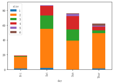
1 | tips = pd.read_csv('examples/tips.csv') |
| size | 1 | 2 | 3 | 4 | 5 | 6 |
|---|---|---|---|---|---|---|
| day | ||||||
| Fri | 1 | 16 | 1 | 1 | 0 | 0 |
| Sat | 2 | 53 | 18 | 13 | 1 | 0 |
| Sun | 0 | 39 | 15 | 18 | 3 | 1 |
| Thur | 1 | 48 | 4 | 5 | 1 | 3 |
<matplotlib.axes._subplots.AxesSubplot at 0x1f859308dc0>
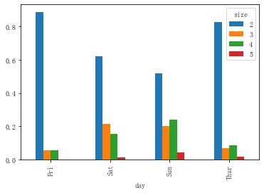
1 | party_counts = party_counts.loc[:, 2:5] |
| size | 2 | 3 | 4 | 5 |
|---|---|---|---|---|
| day | ||||
| Fri | 16 | 1 | 1 | 0 |
| Sat | 53 | 18 | 13 | 1 |
| Sun | 39 | 15 | 18 | 3 |
| Thur | 48 | 4 | 5 | 1 |
1 | # Normalize to sum to 1 |
| size | 2 | 3 | 4 | 5 |
|---|---|---|---|---|
| day | ||||
| Fri | 0.888889 | 0.055556 | 0.055556 | 0.000000 |
| Sat | 0.623529 | 0.211765 | 0.152941 | 0.011765 |
| Sun | 0.520000 | 0.200000 | 0.240000 | 0.040000 |
| Thur | 0.827586 | 0.068966 | 0.086207 | 0.017241 |
<matplotlib.axes._subplots.AxesSubplot at 0x1f859566df0>
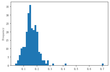
直方图和密度图
1 | plt.figure() |
<Figure size 432x288 with 0 Axes>


<Figure size 432x288 with 0 Axes>
1 | tips['tip_pct'] = tips['tip'] / tips['total_bill'] # 小费占消费总额的百分比 |
<matplotlib.axes._subplots.AxesSubplot at 0x1f8596c4a90>
1 | plt.figure() |
<Figure size 432x288 with 0 Axes>

<Figure size 432x288 with 0 Axes>
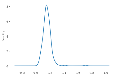
1 | tips['tip_pct'].plot.density() # 等价于plot(kind='kde') |
<matplotlib.axes._subplots.AxesSubplot at 0x1f85973ff10>
1 | plt.figure() |
<Figure size 432x288 with 0 Axes>


<matplotlib.axes._subplots.AxesSubplot at 0x1f863e21280>
散布图
1 | macro = pd.read_csv('examples/macrodata.csv') |
| cpi | m1 | tbilrate | unemp | |
|---|---|---|---|---|
| 198 | 5.379386 | 7.296210 | 0.157004 | 1.791759 |
| 199 | 5.357407 | 7.362962 | -2.120264 | 1.931521 |
| 200 | 5.359746 | 7.373249 | -1.514128 | 2.091864 |
| 201 | 5.368165 | 7.410710 | -1.714798 | 2.219203 |
| 202 | 5.377059 | 7.422912 | -2.120264 | 2.261763 |
| cpi | m1 | tbilrate | unemp | |
|---|---|---|---|---|
| 198 | -0.007904 | 0.045361 | -0.396881 | 0.105361 |
| 199 | -0.021979 | 0.066753 | -2.277267 | 0.139762 |
| 200 | 0.002340 | 0.010286 | 0.606136 | 0.160343 |
| 201 | 0.008419 | 0.037461 | -0.200671 | 0.127339 |
| 202 | 0.008894 | 0.012202 | -0.405465 | 0.042560 |
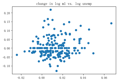
1 | plt.figure() |
<Figure size 432x288 with 0 Axes>
<matplotlib.collections.PathCollection at 0x1f863eb40d0>


Text(0.5, 1.0, 'change in log m1 vs. log unemp')
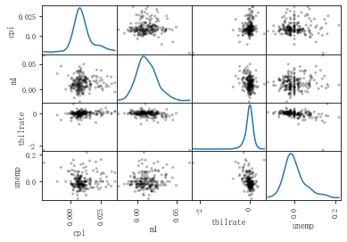
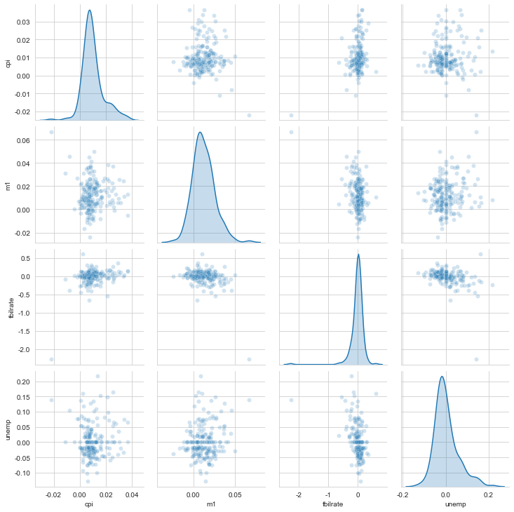
- pandas
提供了一个能从DataFrame创建散布矩阵的
scatter_matrix函数,
1 | pd.plotting.scatter_matrix(trans_data, diagonal='kde', |
array([[<matplotlib.axes._subplots.AxesSubplot object at 0x000001F863EE1760>,
        <matplotlib.axes._subplots.AxesSubplot object at 0x000001F863F04760>,
        <matplotlib.axes._subplots.AxesSubplot object at 0x000001F863F30BB0>,
        <matplotlib.axes._subplots.AxesSubplot object at 0x000001F863F5D0A0>],
       [<matplotlib.axes._subplots.AxesSubplot object at 0x000001F863F96490>,
        <matplotlib.axes._subplots.AxesSubplot object at 0x000001F863FC3820>,
        <matplotlib.axes._subplots.AxesSubplot object at 0x000001F863FC3910>,
        <matplotlib.axes._subplots.AxesSubplot object at 0x000001F863FF0DF0>],
       [<matplotlib.axes._subplots.AxesSubplot object at 0x000001F864056640>,
        <matplotlib.axes._subplots.AxesSubplot object at 0x000001F864081A90>,
        <matplotlib.axes._subplots.AxesSubplot object at 0x000001F8640AFEE0>,
        <matplotlib.axes._subplots.AxesSubplot object at 0x000001F8640E7370>],
       [<matplotlib.axes._subplots.AxesSubplot object at 0x000001F8641147C0>,
        <matplotlib.axes._subplots.AxesSubplot object at 0x000001F864141C10>,
        <matplotlib.axes._subplots.AxesSubplot object at 0x000001F86416D100>,
        <matplotlib.axes._subplots.AxesSubplot object at 0x000001F8641A74F0>]],
      dtype=object)
Seaborn画图
Seaborn在matplotlib的基础上进行了更高级的API封装,从而使得作图更加容易。
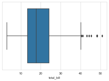
箱线图
1 | import seaborn as sns |
1 | sns.set_style("whitegrid") |
1 | tips.head() |
| total_bill | tip | sex | smoker | day | time | size | |
|---|---|---|---|---|---|---|---|
| 0 | 16.99 | 1.01 | Female | No | Sun | Dinner | 2 |
| 1 | 10.34 | 1.66 | Male | No | Sun | Dinner | 3 |
| 2 | 21.01 | 3.50 | Male | No | Sun | Dinner | 3 |
| 3 | 23.68 | 3.31 | Male | No | Sun | Dinner | 2 |
| 4 | 24.59 | 3.61 | Female | No | Sun | Dinner | 4 |
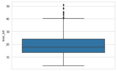
1 | # 绘制箱线图 |
1 | # 竖着放的箱线图,也就是将x换成y |
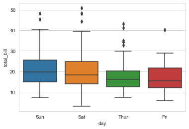
1 | # 分组绘制箱线图,分组因子是day,在x轴不同位置绘制 |
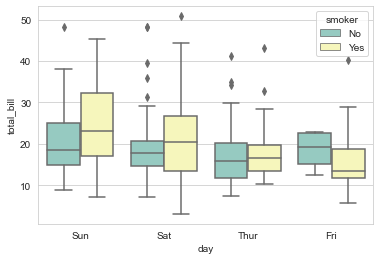
1 | # 分组箱线图,分子因子是smoker,不同的因子用不同颜色区分 |
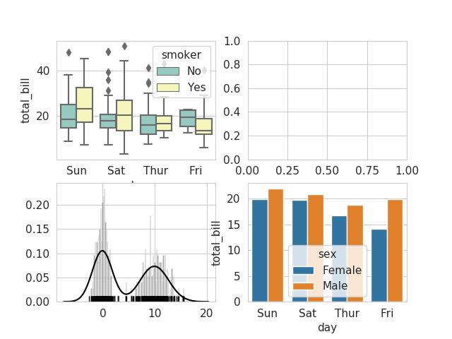
1 | fig,axes = plt.subplots(2,2) |
1 | sns.boxplot(x="day", y="total_bill", hue="smoker", |
<matplotlib.axes._subplots.AxesSubplot at 0x1f8645ce9a0>
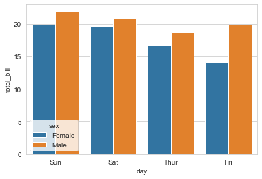
1 | sns.barplot(x="day", y="total_bill", hue="sex", data=tips, ci=0,ax=axes[1][1]) |
<matplotlib.axes._subplots.AxesSubplot at 0x1f864510340>
1 | comp1 = np.random.normal(0, 1, size=200) |
<matplotlib.axes._subplots.AxesSubplot at 0x1f86404a6a0>
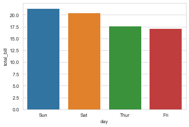
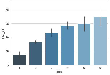
barplot直方图
- seaborn的
barplot()利用矩阵条的高度反映数值变量的集中趋势,以及使用errorbar功能(差棒图)来估计变量之间的差值统计。请谨记barplot展示的是某种变量分布的平均值,当需要精确观察每类变量的分布趋势,boxplot与violinplot往往是更好的选择。
1 | seaborn.barplot(x=None, y=None, hue=None, data=None, order=None, hue_order=None,ci=95, n_boot=1000, units=None, orient=None, color=None, palette=None, saturation=0.75, errcolor='.26', errwidth=None, capsize=None, ax=None, estimator=<function mean>,**kwargs) |
Show point estimates and confidence intervals as rectangular bars.
1 | sns.set_style("whitegrid") |
1 | # 分组的柱状图 |
1 | # 绘制变量中位数的直方图,estimator指定统计函数 |
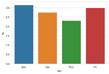
1 | x = sns.barplot("size", y="total_bill", data=tips, |
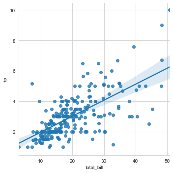
回归图lmplot
1 | g = sns.lmplot(x="total_bill", y="tip", data=tips) |
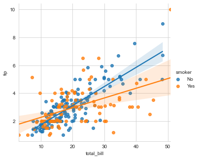
1 | # 分组的线性回归图,通过hue参数控制 |
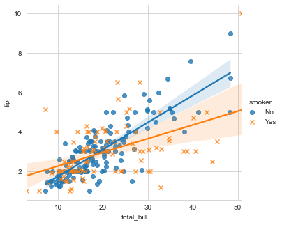
1 | # 分组绘图,不同的组用不同的形状标记 |
1 | # 不仅分组,还分开不同的子图绘制,用col参数控制 |
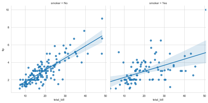
barplot绘图 柱状图
1 | tips['tip_pct'] = tips['tip'] / (tips['total_bill'] - tips['tip']) |
| total_bill | tip | sex | smoker | day | time | size | tip_pct | |
|---|---|---|---|---|---|---|---|---|
| 0 | 16.99 | 1.01 | Female | No | Sun | Dinner | 2 | 0.063204 |
| 1 | 10.34 | 1.66 | Male | No | Sun | Dinner | 3 | 0.191244 |
| 2 | 21.01 | 3.50 | Male | No | Sun | Dinner | 3 | 0.199886 |
| 3 | 23.68 | 3.31 | Male | No | Sun | Dinner | 2 | 0.162494 |
| 4 | 24.59 | 3.61 | Female | No | Sun | Dinner | 4 | 0.172069 |
<matplotlib.axes._subplots.AxesSubplot at 0x1f8644654f0>
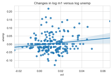
sns.regplot线性回归拟合图。
1 | plt.close('all') |
<matplotlib.axes._subplots.AxesSubplot at 0x1f864b37eb0>


Text(0.5, 1.0, 'Changes in log m1 versus log unemp')
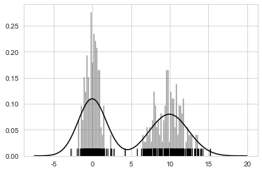
- seaborn的
displot()集合了matplotlib的hist()与核函数估计kdeplot的功能,增加了rugplot分布观测条显示与利用scipy库fit拟合参数分布的新颖用途。
seaborn.displot(a, bins=None, hist=True, kde=True,rug=False, fit=None, hist_kws=None, kde_kws=None, rug_kws=None, fit_kws=None, color=None, vertical=False, norm_hist=False, axlabel=None, label=None, ax=None)
1 | # sns 绘图 |
<matplotlib.axes._subplots.AxesSubplot at 0x1f8649ae0d0>
Python seaborn.pairplot(data, hue=None, hue_order=None, palette=None, vars=None, x_vars=None, y_vars=None, kind='scatter', diag_kind='hist', markers=None, size=2.5, aspect=1, dropna=True, plot_kws=None, diag_kws=None, grid_kws=None)¶1
2
3
4
5
6
7
Plot pairwise relationships in a dataset.


```python
sns.pairplot(trans_data, diag_kind='kde', plot_kws={'alpha': 0.2})
plt.show()
<seaborn.axisgrid.PairGrid at 0x1f864ac8ac0>
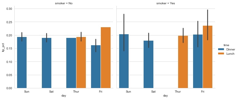
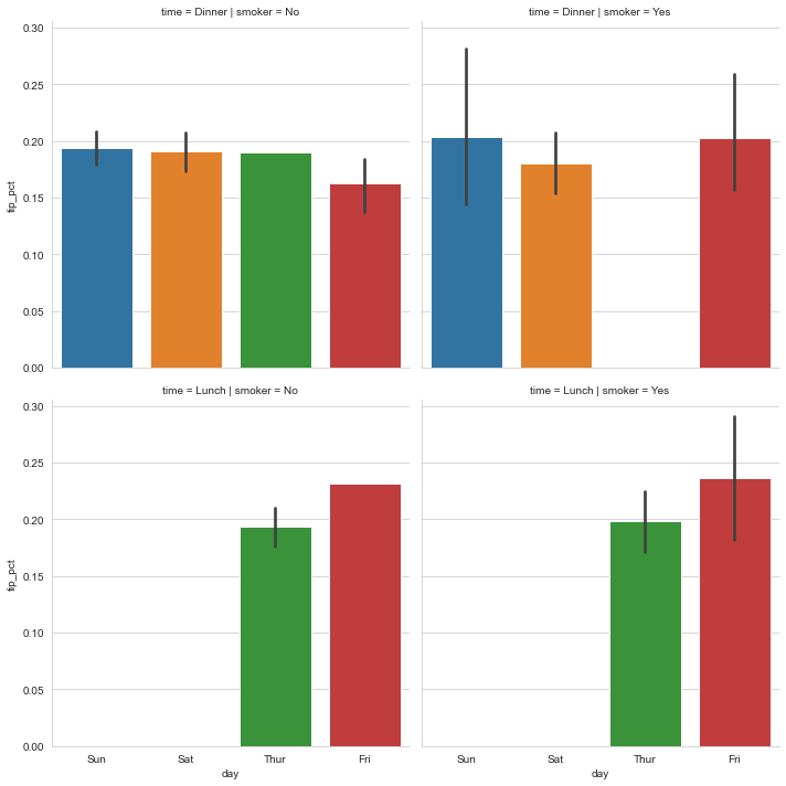
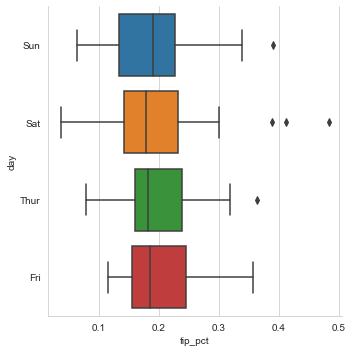
网格和分类数据
因子变量-数值变量 的分布情况图Draw a categorical plot onto a FacetGrid.
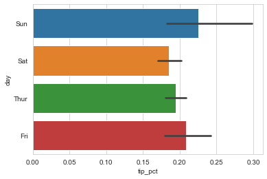
1 | seaborn.catplot(x=None, y=None, hue=None, data=None, row=None, col=None, col_wrap=None, estimator=<function mean>, ci=95, n_boot=1000, units=None, order=None, hue_order=None, row_order=None, col_order=None, kind='point', size=4, aspect=1, orient=None, color=None, palette=None, legend=True, legend_out=True, sharex=True, sharey=True, margin_titles=False, facet_kws=None, **kwargs) |
1 | sns.catplot(x='day', y='tip_pct', hue='time', col='smoker', |
<seaborn.axisgrid.FacetGrid at 0x1f865e0bca0>
1 | sns.catplot(x='day', y='tip_pct', row='time', |
<seaborn.axisgrid.FacetGrid at 0x1f865f39070>
1 | sns.catplot(x='tip_pct', y='day', kind='box', |
<seaborn.axisgrid.FacetGrid at 0x1f865d18b50>
其他Python可视化工具
- 绘制地图Basemap / Cartopy